AIR Data
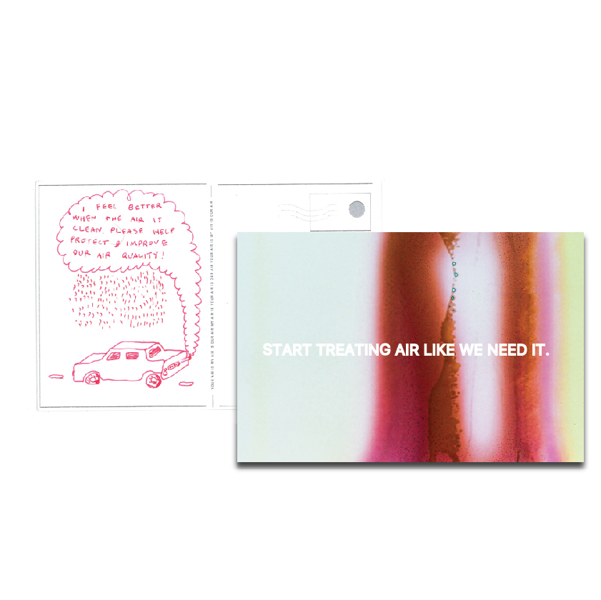
Data that maps air pollution is generated and geared towards scientists rather than affected communities. We are currently developing ways to humanize this data and make it accessible to the public in order to inspire action and positive change.
Through navigation mapping and visualizations this data comes to life.

this project AIMS to not only inform the public but to give them agency. until now, there have been no major efforts in NYC to alleviate air pollution or even to inform the public about it.
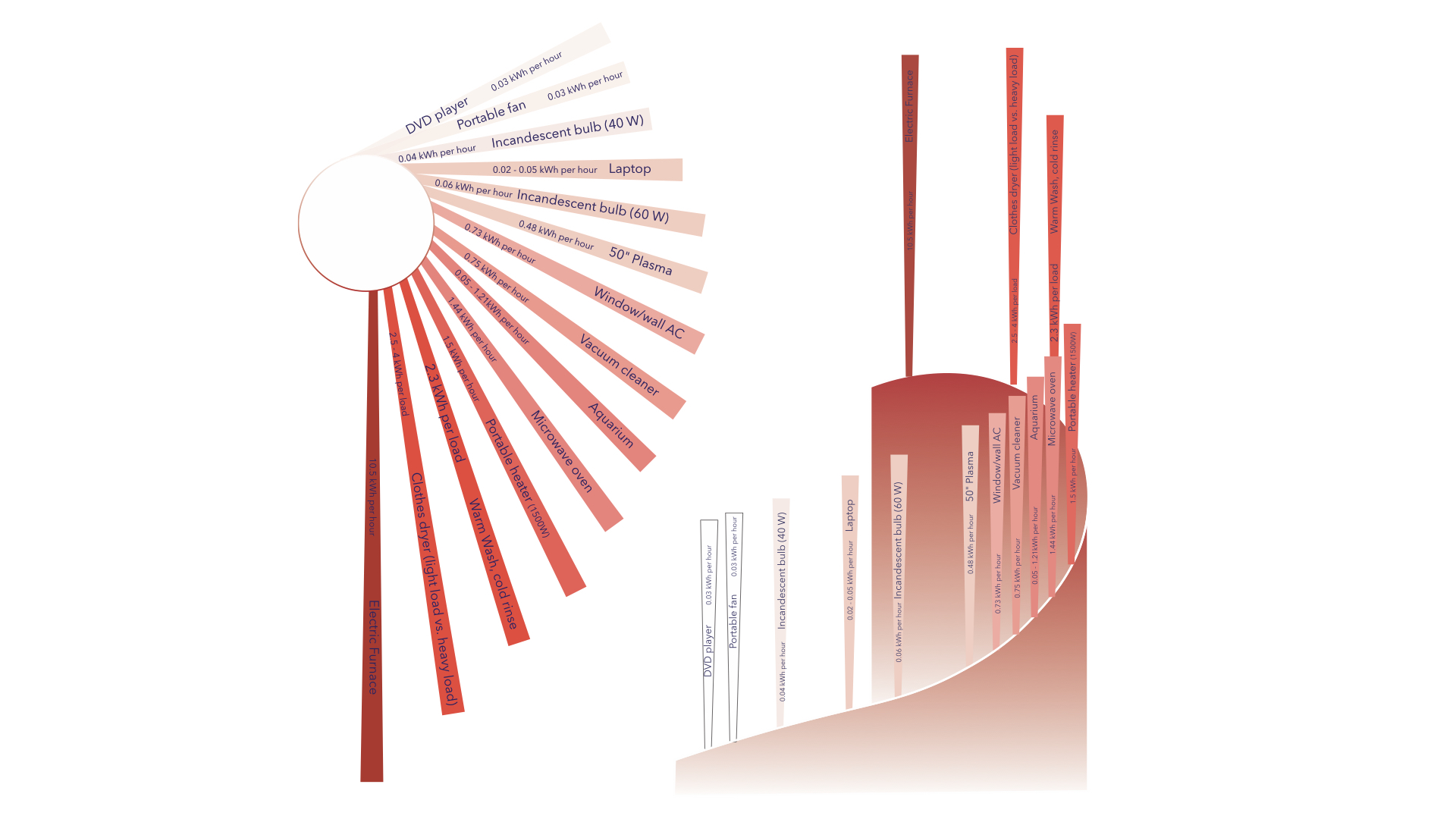
Sketch 2. Which everyday items use the most electricity? If your electricity comes from coal, it adds to air pollution
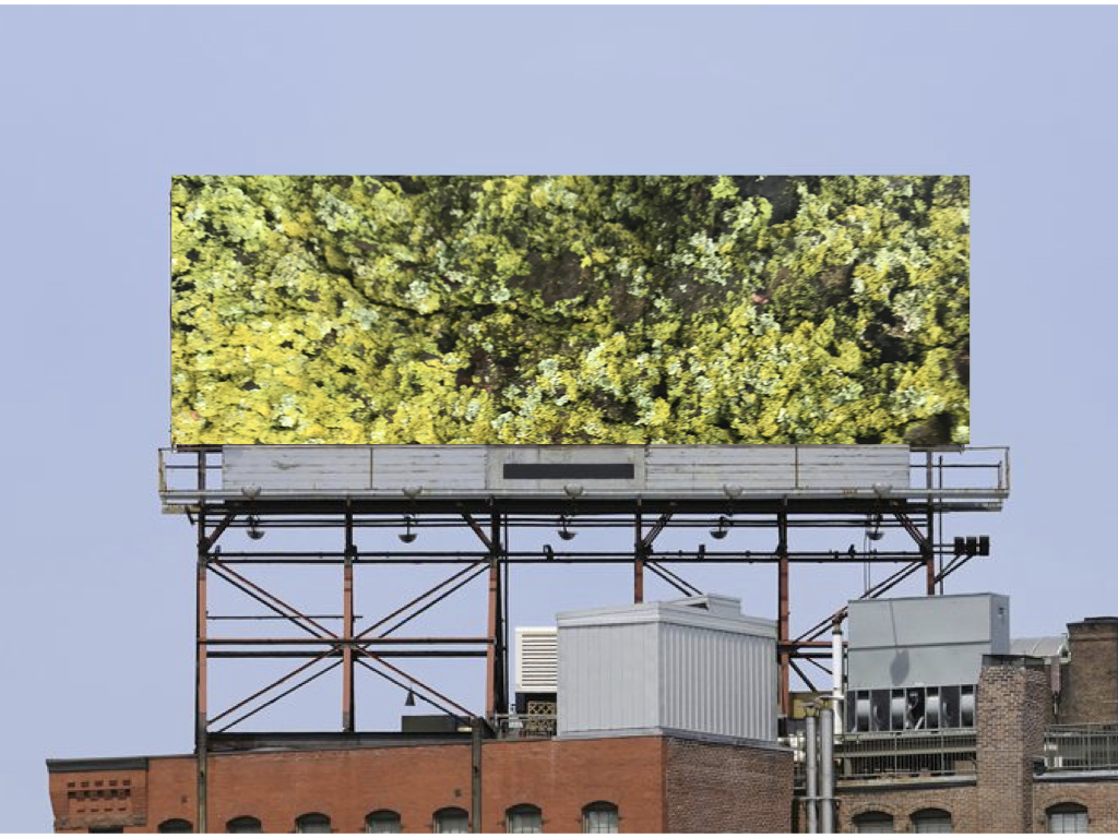
The second part of this project translates this data from the digital into physical space in nyc. Using site specific installation to reflect the data OAL aims to connect findings of the scientific community to the power of the public.

Sketch 3. Maps visualizing data of quality of space. Map 1: Aggregate air pollutant levels. Map 2: Water Map 3: Aggregate sound levels.

Sketch 4: Where does electricity come from and how much do you use over the course of a year.
explore more projects: